Motion Chart with Plotly
This is a concise script for creating a motion chart using Python and Plotly Express.
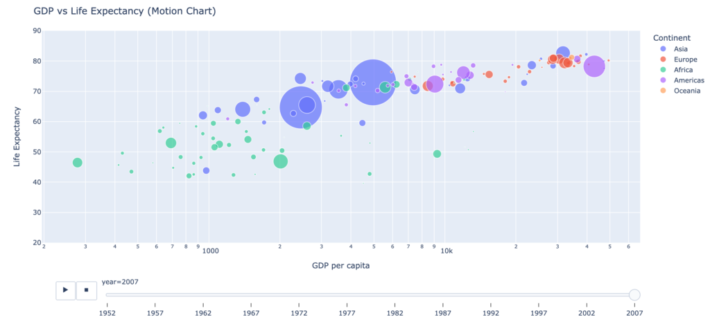
The script loads the ‘gapminder’ dataset, which contains information about the GDP per capita, life expectancy, population, and continent for various countries around the world. The script then creates a bubble chart using the data, with GDP per capita on the x-axis, life expectancy on the y-axis, and population represented by the size of the bubbles.
The bubbles are also colored by continent, and the chart includes an animation feature that shows how these metrics change over time.
The script also customizes the chart layout, adding a title and axis labels. Finally, the chart is displayed using the ‘show’ method.
import plotly.express as px
df = px.data.gapminder() # load the gapminder data

# create a bubble chart using plotly express
fig = px.scatter(df, x="gdpPercap", y="lifeExp", size="pop", color="continent", log_x=True,
                  animation_frame="year", range_y=[20, 90], hover_name="country", size_max=60)

# customize the chart layout
fig.update_layout(title='GDP vs Life Expectancy (Motion Chart)', xaxis_title='GDP per capita',
                  yaxis_title='Life Expectancy', legend_title='Continent', height=600)
fig.show()